VKC Item Text Plane

VKC Item Text Plane will display the designated text at the object position attaching this component.
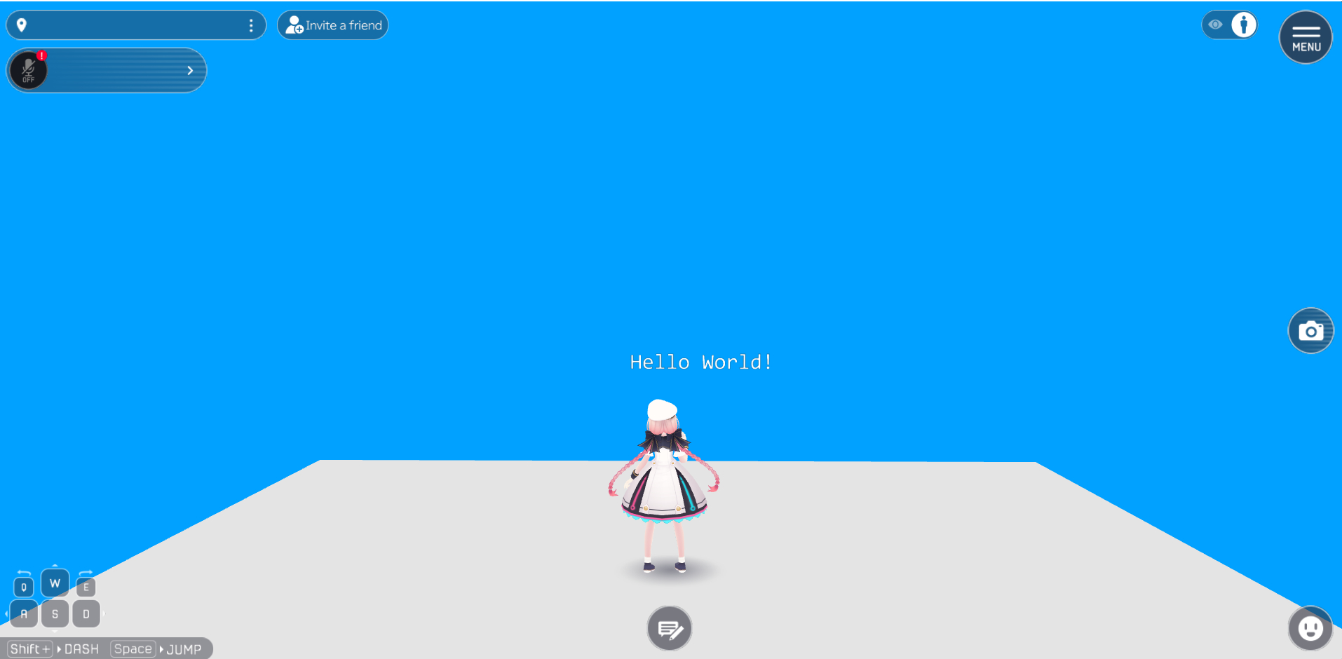
For example, by Build & Running the world the text will be displayed as below:

Available methods for this object type
Settings
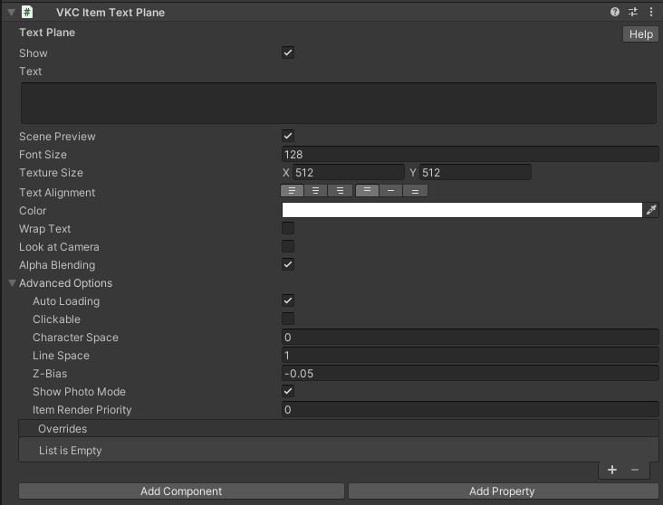
| Label | Initial Value | Function |
|---|---|---|
| Show | true | Enable this if you want the text to display by default |
| Text | blank | Input the text to be displayed |
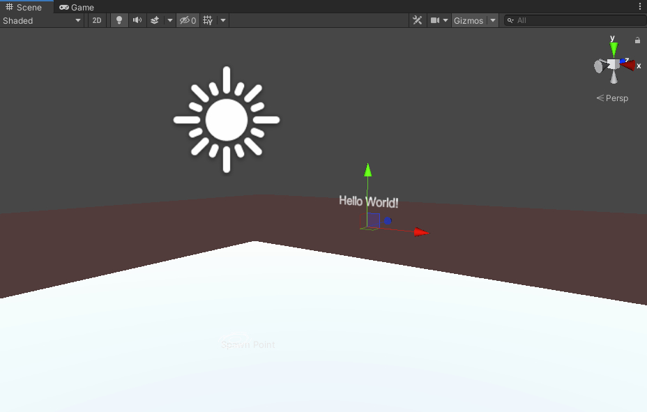
| Scene Preview | true | Enable/Disable text preview in the Unity editor's Scenet view. This setting is a beta feature |
| Font Size | 128 | Specify the text size |
| Font Weight | 400 | Specify the boldness |
| Texture Size | X:512 Y:512 | Specify the base resolution for the displayed text texture Value needs to be a power of two! |
| Text Alignment | Left Top | Set the text alignment and centering for display |
| Color | #FFFFFF | Specify the text color |
| Wrap Text | false | Enable/Disable automatic text wrapping |
| Look at Camera | false | Make the text face towards the camera at all times |
| Alpha Blending | true | Lets you use cutout/transparency |
caution
In the Text property, if you want to insert a line break, specify "\n" in the string.
If you input any other regular expressions (e.g. tab "\t", line break "\r", backspace "\b"), a build error will occur.
Font Weight is not available in the stable SDK 14.4.12
Font Weight cannot be used in the stable SDK 14.4.12 because its functionality has been rolled back. If you have SDK 14.2.1 or any version later than 14.4.12, please use that instead.
Advanced
| Label | Initial Value | Function |
|---|---|---|
| Auto Loading | true | Toggles auto loading enable/disable |
| Clickable | false | Toggles acceptance of click input from player |
| Character Space | 0.0 | Set the character space by pixel |
| Line Space | 1.0 | Set the line space by pixel |
| Z-Bias | -0.05 | Higher z value will make the text drawn in front of other objects |
| Show Photo Mode | true | Toggles display/hide item when in photo mode |
| Overrides | On Entering the world, the text set in this text property will be used instead Text in VKC Item Text Plane. |
caution
The Overrides property is currently under progress.
Further usage are to be added by future updates.
By enabling preview, the designated text will be shown in the Scene view as below:

Note
The Billboard setting in pre-Ver9.3 components has been renamed to Look at Camera.
If the scene data is migrated from past SDK versions, the Billboard setting value will be reflected to Look at Camera.